I've just shipped out a special custom order, bangle tiger mailbox this week. I was contacted by this customer a few months ago as she wanted to discusss a special design that would coordinate with the inside of her house.

She forwarded samples of her wallpaper with the lily and butterfly design that you see in the top photo. The wallpaper has a very contemporary look and so to keep that theme, I matched the flowers and butterfly to the wallpaper. I kept the color palette simple on this one, gray, silver, black and white were the main colors that the customer wanted in order to echo the design of the wallpaper.

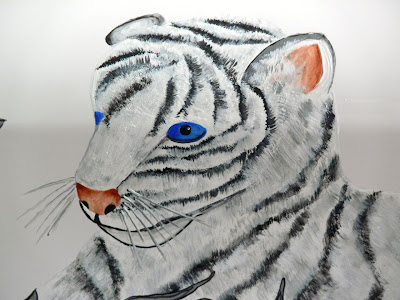
She also sent me a photo of a special piece in her home, a stuffed animal, bangle tiger that she had on display. Her one request for the painted tiger was that he retain the piercing blue eyes that the stuffed animal version had. The tiger was painted on the box and then I incorporated the contemporary floral design around him. I think the two go very well together. Fun but also very challenging at times to create this one.
 I've just shipped out a special custom order, bangle tiger mailbox this week. I was contacted by this customer a few months ago as she wanted to discusss a special design that would coordinate with the inside of her house.
 She forwarded samples of her wallpaper with the lily and butterfly design that you see in the top photo. The wallpaper has a very contemporary look and so to keep that theme, I matched the flowers and butterfly to the wallpaper. I kept the color palette simple on this one, gray, silver, black and white were the main colors that the customer wanted in order to echo the design of the wallpaper.
 She also sent me a photo of a special piece in her home, a stuffed animal, bangle tiger that she had on display. Her one request for the painted tiger was that he retain the piercing blue eyes that the stuffed animal version had. The tiger was painted on the box and then I incorporated the contemporary floral design around him. I think the two go very well together. Fun but also very challenging at times to create this one.


31 comments:
Oh Ruth that is gorgeous!! I really like the way you incorporated the colors together and matched it with the wallpaper and those blue eyes...they just POP!
Fabulous!
Hugs
JO
Good job! I don't usually like painting for others if they don't like the same things I like.
Thanks Jo, sweet of you to say.
Jean, I actually enjoy painting things outside of the norm. Keeps the spice in artistic life some how.
Good Morning Ruth!
Wow! I love the texture in his fur. He is wonderful.
He pops off of the white mailbox even though he is white too. Very impressive!
Melissa
Thanks Melissa. I actually would have prefered to paint this design on a black mailbox, I feel it would have been even more striking. One of the customers specifications was that she really wanted a white mailbox so, I did have to use the white. I do paint mostly on the white but have to say, I would have liked to see this particular design on black, it would have been striking.
Hi Ruth, gorgeous tiger, love the blue eyes. A perfect match with the wallpaper. Beautiful art! Have a great day! Jenn and Jacqui
Hey Ruth,
I think that is interesting what you say about the black background, however from a different artistic perspective...I think the white background rather makes it pop because the image doesnt get lost ...I think the black might cause it to disappear because the background would be more noticeable first
Just a different opinion...this in no way reflects your artistic work...I love what you do..and your talent is amazing.
HUGS
JO
Hi Jenn & Jacqui, thanks for your visit and for you compliments.
Jo, I agree...I actually don't like mailboxes that are black that have hand painted designs. Even after changing the colors around, I still always feel the design shows better on a white box. I only paint black if a customer really wants it. Also, they are a bear to clean and get ready to spray with their protective coatings as well. With a white one, you clean it and you're done, it gets sprayed...the end. With a black box, you always find more lint on it after you clean it. It is like there is a sign on the black ones saying "lint balls of the world land here."
I would have had to change the flower colors around for sure, so they would stand out better on the black. I just really would have liked to see the tiger on the black background this time. However, the customer liked it white, and I liked it too, with the white...I certainly think the flowers stand out better and really get their point across better on the white box. I guess as this point if I want to envision the tiger on black, I'll have to cut out his photo and hold him up to a black box.
Great work Ruth, the eyes make a fantastic feature, well done!
Thanks Gail. The eyes were taken from the customer's stuffed animal. The one thing she really wanted the tiger to have , were those beautiful blue eyes.
That'll be the coolest mailbox on the block! Beautiful work, Ruth.
Oh Ruth...
Once again beautiful!
Priscilla
That is just GORGEOUS Ruth! I love the color of the eyes. I'd be proud to call that my mailbox! =)
Gorgeous!! You certainly are blessed with a wonderful talent! WOW!!hugs NG
Thank you Linda, Priscilla, Louise & NG. The customer called me yesterday to let me know she was very happy with it so, that makes me happy too.
I'm sure she was happy with it cause it gorgeous!
Manuela
How very interesting and fascinating. Beautiful work Ruth.
This will be the best mailbox on the block. It's just beautiful. I love how you captured such a sweet look. Your work is outstanding.
Thanks Manuela, Lynn & IT....
It's an adorable mailbox...Love the gorgeous blue eye's, and the way he pops, even though he is the same color as the background..
beautiful as alway's, & so creative!
Cat
Ruth, that is stunning! Those eyes really capture your attention.
Penny
Oh, my that is so beautiful! You are soooo talented!
Melissa
Thank you Catherine, Penny & Melissa.
Those eyes are beautiful....you are truly talented!
blessings, kari and kijsa
Thanks Kari & Kijsa.
Hey Ruth,
Perhaps you should try that... you have peaked my curiosity into wondering ... what it would look like on a black background
JO
I might just do that some day Jo. LOL...it's the only way I'll get to see it done that way. If I ever get a chance to buy a black mailbox for anything else, I'll do just that. If it doesn't look too silly, I'll post a picture of it on the blog. : )
Great job Ruth! I'm sure your customer is pleased. I've digitally painted pictures of friend's pets in the past. It's fun to do something different now and again. xoxo
Thanks Betty Jo. This was actually a nice change from a customer's pet because the pressure wasn't there to make it look like a specific animal. A much lower pressure situation.
I would really love to see your digital animal portraits some day.
What a fun piece! Great job Ruth!
Thanks Suzanne.
Post a Comment